The “now do this” moment, in one block
You’ve built a whole landing page and reached the part that actually matters — the bit that asks the visitor to sign up, book a call, or download the thing. So you drop in a heading, then a line of text under it, then a button, then maybe a second button. Four blocks, and now you’re nudging each one until they line up and sit the way you pictured. Change your mind about the spacing and you’re editing all four again.
The CTA block keeps that whole moment together. The heading, the supporting line and the buttons are one block you place once — and move, copy or restyle as a single piece.
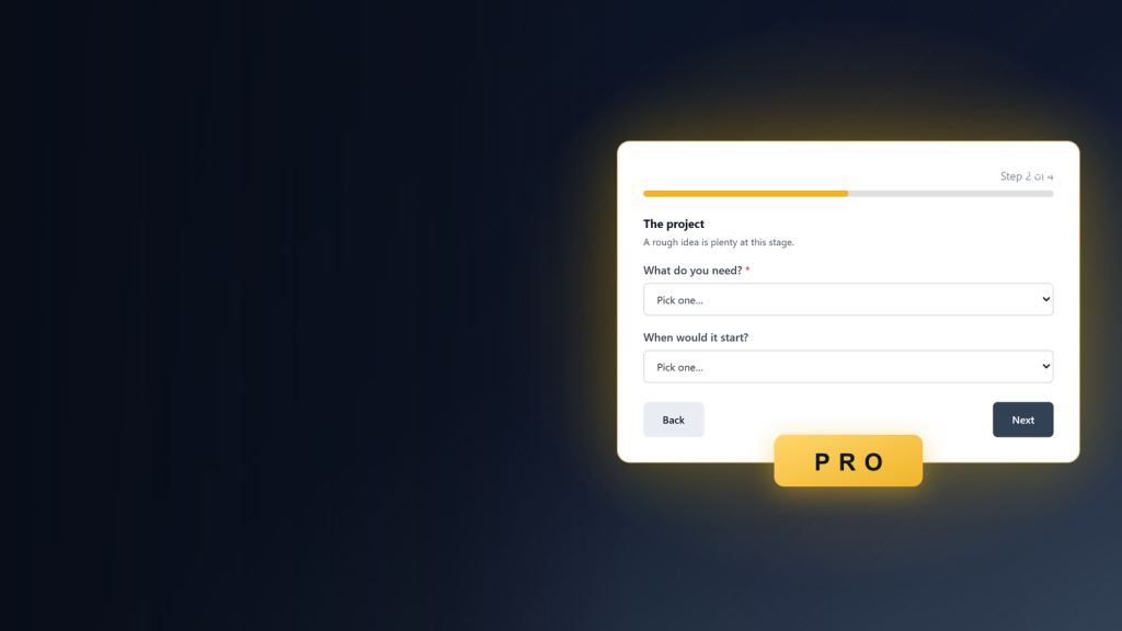
Setting one up takes a minute. Type your heading and line, fill in the button label and link, and if you want a second button flip one switch. Pick centred for a focused promo or split for a wide banner, and the preview rearranges as you choose — no lining up loose blocks, no leftover gaps.
Centred, one button. The message stacked in the middle with a single action — the focused promo you drop at the end of a page.
Start your project today
One heading, one line, one button — the focused promo you drop at the end of a page.
Split, with a second button. The copy sits on one side and the buttons on the other — a wide banner for a full-width strip.
Ready when you are
Message on one side, buttons on the other — a wide banner for a full-width strip.
Dark surface, its own colours. The same block on a deep background, with the text and buttons recoloured through the light and dark value pairs.
Join the list before Friday
A darker banner for a bolder moment — every part still styled from inside the one block.
Ready to add your own call-to-action?
The CTA block ships with Flexa Block. Install it and it’s waiting in the editor the next time you open a page — the live banners above are the same block.