
Layout blocks
Structure your page with flexible containers, grids and sliders.
Container
A section wrapper with per-device flex layout, background, borders and spacing. Nest anything inside it.
Grid
A CSS grid that arranges inner blocks into responsive columns and rows with track gaps.
Slider (Slides + Slide)
A carousel of slides with autoplay, transitions, arrows and dots. Each Slide holds any blocks.
Content & media
The building blocks for text, imagery and calls to action.
Heading
A rich heading with optional eyebrow, subheading, separator, gradient text and effects.
A stylish heading
Text
A rich paragraph with per-device typography, colours, hover colour and an optional drop cap.
This is a Text block. It supports per-device typography, solid or gradient colour, and a drop cap for editorial layouts like this one.
Button
A call-to-action link with fill, outline or ghost variants, sizes, icons and hover states.
Image
A media image with per-device width, aspect-ratio lock, hover motion, caption and lightbox.

Separator
A horizontal divider with per-device width, thickness, alignment and style.
Info Box
An icon or image paired with a title, description and optional button — great for features.
Counter
A grid of stat counters that count up when scrolled into view.
Testimonial
A review card with star rating, quote and an author block (avatar, name, role).
A great tool
Flexa made it effortless to build a polished page without touching a line of CSS.

Icon
A single icon with shape, colour, size, link and hover states.
Icon List
A checklist of items, each with its own icon, link and hover colour.
Notice
An inline message in info, success, warning or error tone, optionally dismissible.
Star Rating
A star score with optional title and review schema for rich results.
Data Table
A striped, hoverable table built from columns and rows in the editor.
| Block | Category | Since |
|---|---|---|
| Container | Layout | 1.0 |
| Pricing Table | Marketing | 1.4 |
| Post Grid | Dynamic | 1.5 |
Team Member
A profile card with photo, name, role, bio and social links.
Emma Carter
Product DesignerDesigns the block library and keeps every panel consistent.
Lottie Animation
Play a Lottie/dotLottie animation on load, on scroll or on hover.
Interactive blocks
Engaging, motion-rich blocks that respond to your visitors.
Tabs
Organise content into a tab bar that collapses into an accordion on mobile.
Tabs keep related content tidy and scannable.
Each tab can hold any plain text content you like.
Underline, pill or boxed styles are available.
Steps
A vertical timeline of process steps with numbered, icon or image markers.
FAQ
An expandable question-and-answer accordion with open-state icons and schema.
Countdown
A live countdown to a target date with day/hour/minute/second units and labels.
Before / After
A drag-to-reveal image comparison slider with labels and a handle.


Images Gallery
A grid, masonry or tiled gallery with hover motion, captions and a lightbox.





Video Popup
Play a YouTube, Vimeo or MP4 video in a modal lightbox from a thumbnail, button or link.
Modal
A dialog opened by a button, image or text trigger; holds any blocks inside.
Progress Bar
A line or circle progress meter that fills when it scrolls into view.
Timeline
A vertical timeline of milestones with numbered, icon or image markers.
Navigation & social
Wayfinding blocks plus maps and social links.
Breadcrumb
A hierarchical trail, built automatically or by hand, with a chosen separator and schema.
Table of Contents
An auto-built list of the page headings with jump links and smooth scroll.
Social Icons
A linked row of social network icons with official or custom colours and hover motion.
Social Share
Share buttons that post the current page to Facebook, X, LinkedIn or Pinterest.
Google Map
Embed a Google Map for any address or place, with zoom and per-device height.
Dynamic content
Blocks that pull live content from WordPress or an external feed.
Post Grid
A query-driven grid of posts with image, meta, excerpt, read more and pagination.
49 posts found
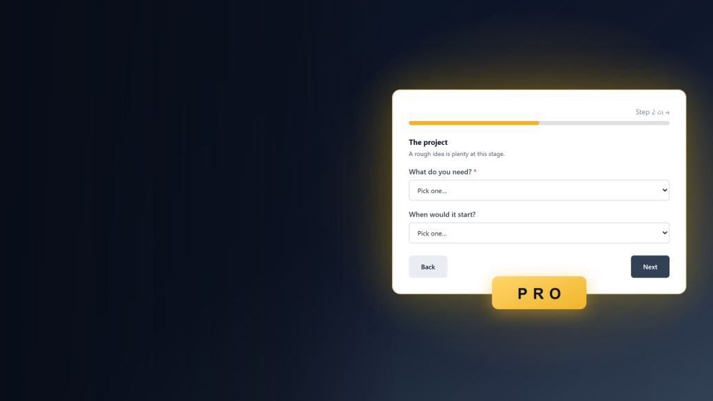
The Multi-Step Form Block: One Long Form, Broken Into Short Steps

The Image Hotspot Block: Point At What Matters In A Picture
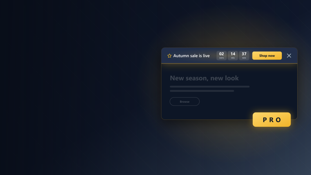
The Sticky Announcement Bar Block: One Message, Pinned Where Nobody Misses It
Post Filter (+ Search, Taxonomy, Reset)
A real GET form that drives a Post Grid. Works without JavaScript; the view script upgrades it to an in-place update.
49 posts found
The Multi-Step Form Block: One Long Form, Broken Into Short Steps
The Image Hotspot Block: Point At What Matters In A Picture
The Sticky Announcement Bar Block: One Message, Pinned Where Nobody Misses It
Taxonomy
A list or grid of terms with post counts, linking to each archive.
Marketing & forms
Hero banners, calls to action and a full newsletter form.
Banner
A promotional hero — heading, description and buttons over a colour, gradient or image.
CTA
A call-to-action banner with a heading, description and primary/secondary buttons.
Ready to get started?
Nudge visitors to take the next step.
Pricing Table
Plan cards with monthly/yearly toggle, feature list, badge and call to action.
Comparison Table
Compare plans feature by feature, with check/cross icons and a spotlighted column.
| Projects | 1 | 10 | Unlimited |
|---|---|---|---|
| All blocks | |||
| Priority support | |||
| Remove branding |
Subscribe Form
A newsletter form built from field child blocks that emails the entry over AJAX.
That is the whole library
Mix and match these blocks to build any page you can imagine. Five WooCommerce product blocks ship too — they render inside a single product template.