The logo row that keeps coming back to you
You finish a client site and the last band before the footer never settles. Six partner logos, every one a different width, half of them PNGs with baked-in white space. In a grid it looks right on your monitor and stacks into a six-screen column on a phone. Then the client signs a new partner, emails you the logo, and the job comes back to you.
The Client Logo Carousel block turns that band into a strip that moves on its own. You add the logos in the sidebar, say how many are visible at once, and the row loops without a seam.
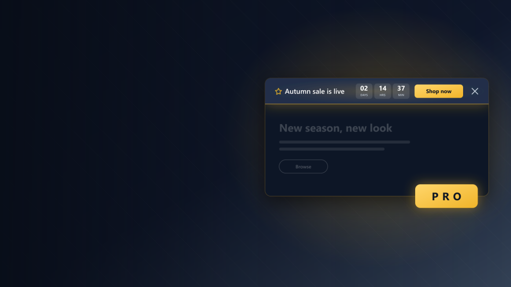
Five logos in view, drifting left, edges faded into the page. Hover the strip and it stops; hover a logo and its colour comes back.






What you get to decide
Under the hood
Most of what goes wrong with a moving strip is invisible on your own machine and obvious to the next visitor.
Two more ways to set the same row
Full colour, drifting right, twice as quick. The same six logos with grayscale switched off.
Autoplay off, six logos in view. Nothing moves until the visitor drags the row.
Setting it up takes about a minute. Drop the block in, add a logo, choose the image, type the brand name into the alt field, repeat. The strip scrolls in the editor as you go, so you feel the speed before you publish. No CSS, no shortcode, nothing to remember.
It sits in the same editor, next to the blocks you already use, and shares the same spacing, colour and responsive controls — it just needs Flexa Block switched on alongside it.
Give your partner row somewhere to go
Add the Client Logo Carousel to your next build and hand over a logo strip the client can keep up to date.