
A dozen good photos, and no tidy way to show them.
You’ve got a shoot, a portfolio or a product set — a folder of images that deserves better than a single column of full-width photos. Building a real gallery by hand means fiddling with rows, gaps and float clears, and it still breaks the moment one photo is portrait instead of landscape.
The Images Gallery block does the arranging for you. Add your photos, pick a layout, and it lays them out in even columns — with a lightbox built in, so a click opens any shot full-size.
Setting it up is drag-and-drop. Add the block, select your images, choose grid, masonry or tiled, and set the columns — the gallery arranges itself in the preview. Turn on the lightbox and captions if you want them. No rows, no floats, no CSS.
See it in action
All three below are the same Images Gallery block with the same kind of photos — only the layout changes. Click any image to open the lightbox and step through the set.
Grid, cropped to one ratio. Every tile trimmed to the same shape for a neat, even grid — hover to zoom, click to open the lightbox.






Masonry, keeping each shape. The same photos left at their own proportions and packed into columns, with a caption showing on each.
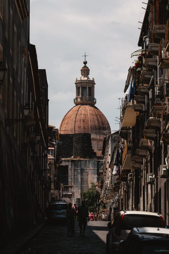



Justified tiles, filling the row. Every image sized to one height and stretched to fill the row edge to edge, portrait and landscape sitting side by side.
Your photos, always in shape
Add or remove a photo and the layout reflows on its own — no re-cropping, no gaps to patch. The columns, the crop, the lightbox and the captions are all controls in the sidebar, so the same gallery looks right on a wide monitor and a phone alike.
Give your photos a gallery
The Images Gallery block ships with Flexa Block. Install it, drop in your photos, and a grid, masonry or tiled gallery with a lightbox is ready in the editor.